How this 1980s walk-up apartment in eastern Singapore was redesigned for family life
The renovation focused on practical changes – including a larger common bathroom, a powder room and a more open kitchen – for calmer family living.

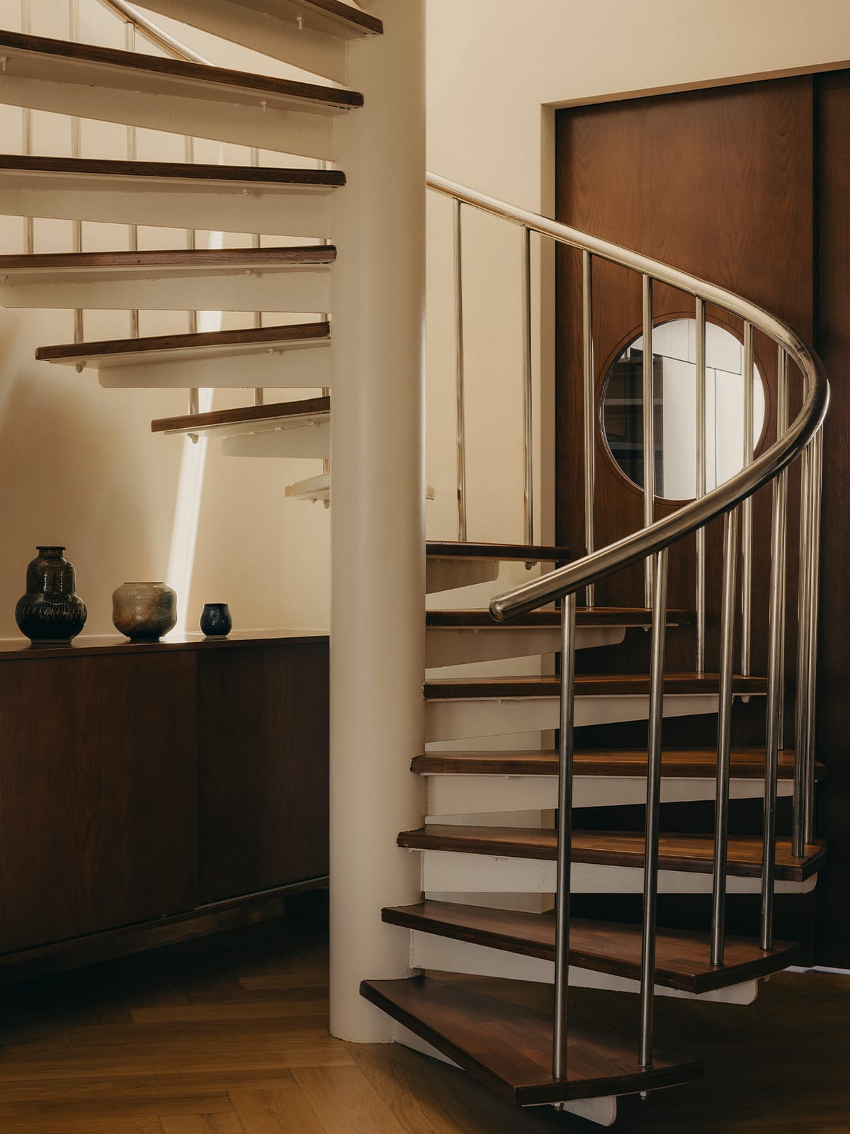
A young family chose a 1980s east Singapore apartment for its original bones – glass brick walls, a spiral staircase, and generous proportions – and set about making it their own. (Photo: Studio Periphery)

This audio is generated by an AI tool.
This apartment in eastern Singapore may not look out over the city, but its view is no less appealing – across the condominium pool and into the emerald canopy of mature trees. Set on the top floor of a mid-1980s walk-up, it has many of the qualities associated with homes of that era – an expansive layout, generously sized rooms and a spacious balcony.
The apartment has a roomy lower level and a small mezzanine that overlooks the living area. Charming original features – such as glass brick walls that filter light and glow at night – were retained. The owners, a couple with two young sons, engaged interior designer Edmund Ong of Shed Studio to tailor the home to their lifestyle.
The wife was formerly in the civil service and now cares for the children full time, so they wanted the home to feel comfortable and inviting. During my visit, she shared that they had initially fallen for a larger apartment nearby – one with a panoramic view – but it was not meant to be, as the owner chose to sell it to someone else.
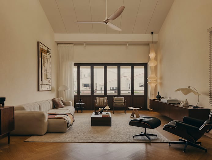
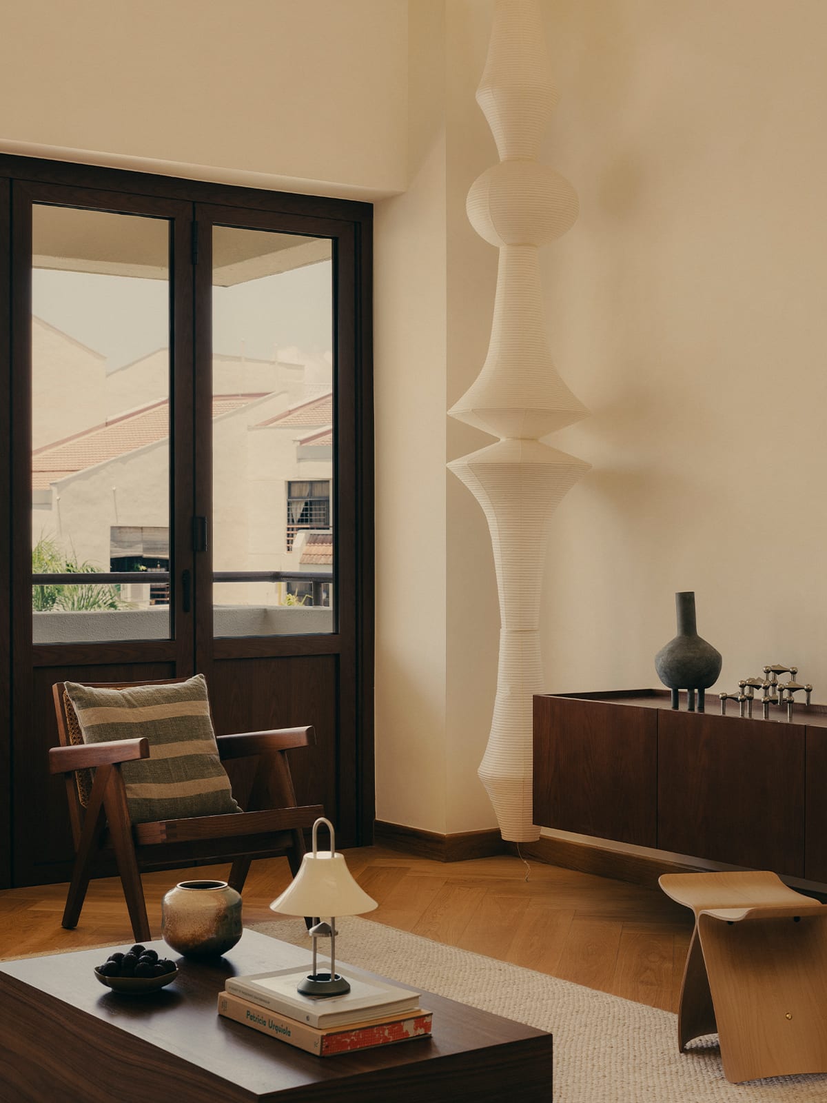
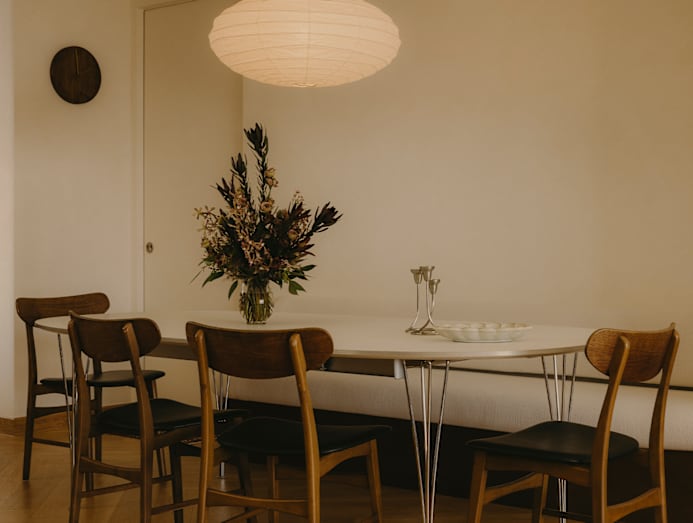
It turned out to be a blessing in disguise – the change of plans gave them the freedom to invest in more thoughtful fit-outs for this home. These include timeless design pieces that bring character to every corner. One example is the Akari E pendant light in the living room – a sculptural paper lamp by American artist Isamu Noguchi that rises towards the double-height ceiling.
“I’m into aesthetics; I like things that look nice,” the wife said when asked whether she was more interested in furniture, design – or both. “I already knew what colour scheme I wanted. These pieces were already in the mood board pictures,” she added with a laugh.
The wife has a keen eye for proportion, scale, material and colour, and is also drawn to beautiful architecture, as this apartment reflects. She shared that they had been especially pleased to find a home with such strong bones and regular proportions, and were careful to preserve its original charm while opening up the kitchen and giving clearer distinction to the various spaces.
Ong’s role was to retain the apartment’s original charm while making it functional for family life. “The brief was to create a place that felt open and expansive while meeting the needs of a young family of four. The couple wanted to focus on natural materials with beautiful textures,” he said.
The selective nip-and-tuck included replacing windows and doors worn down over 40 years. “We also replaced most of the existing finishes, such as the glossy faux marble tiles in the living area and the teak parquet in the bedrooms and mezzanine,” said Ong.
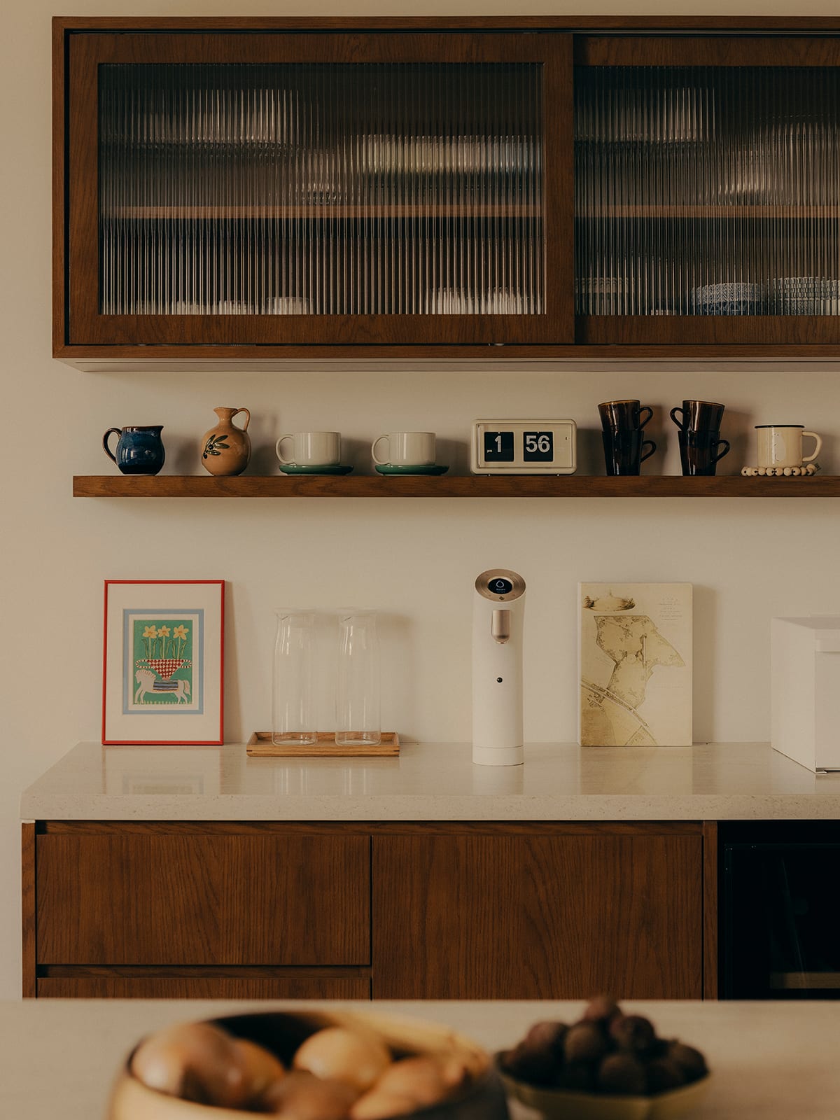
Oak veneer stained to the colour of mahogany was applied to most of the carpentry “for its beautiful reddish tone that adds warmth”. Lighter oak flooring was chosen to “keep the home light and airy despite the darker-coloured carpentry,” Ong explained. In the kitchen, travertine was used for the countertops. The overall white-and-brown palette feels timeless and easy on the eye.
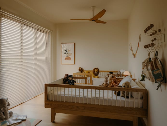
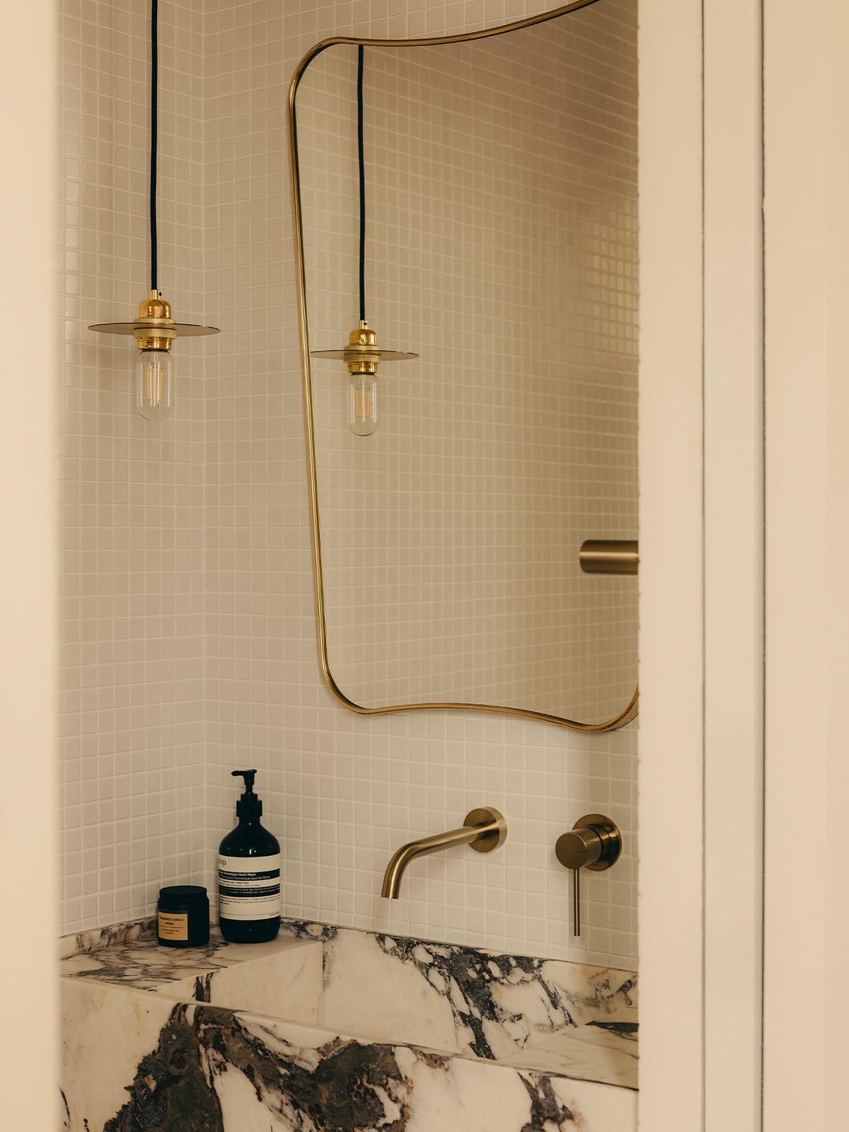
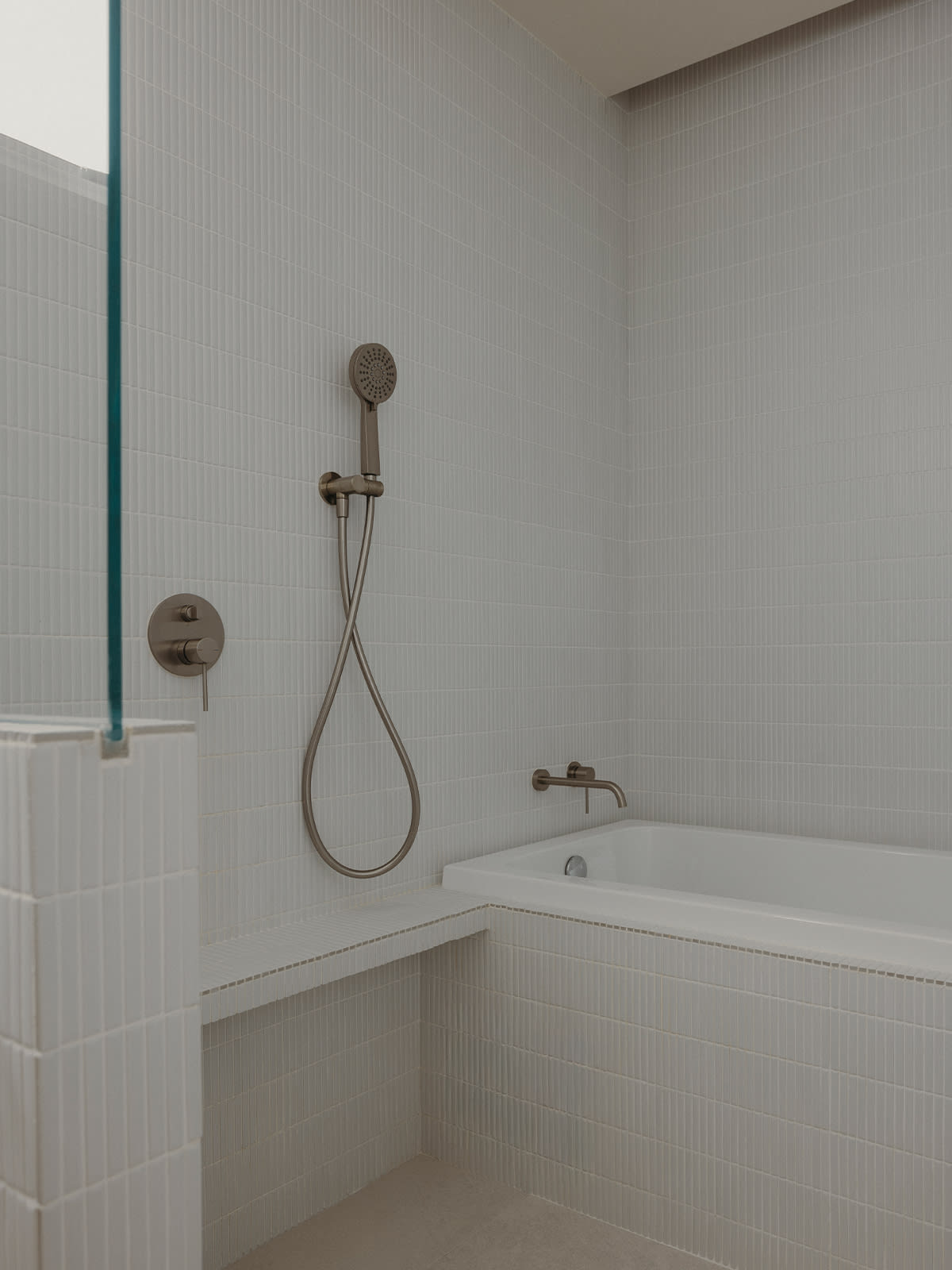
In the original layout, the living room, dining room and kitchen align in a row. A door leads to the private quarters, comprising the master bedroom, two bedrooms, and a common bathroom. The couple wanted to resolve several pain points – the shower in the common bathroom was too small for bathing the children, and the kitchen felt tight and enclosed. They also wanted a powder room for guests, as they preferred to keep the sleeping quarters private, especially when entertaining, Ong said.
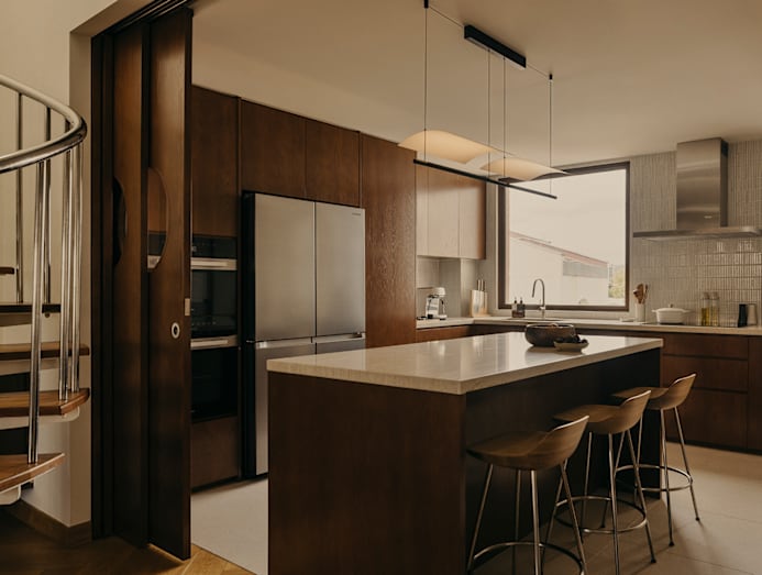
Space was carved out of an existing utility room at the centre of the home – on one side for a larger common bathroom, and on the other for a small powder room accessed from the kitchen. The kitchen was also enlarged to accommodate an island.
Sliding panels divide the kitchen from the dining room, allowing it to be either part of the common areas or closed off, depending on the activity – an arrangement the wife values. “I cook for my family on most days, and I enjoy hosting. I like being able to close the kitchen when I cook, but still keep an eye on my kids through the round windows,” she said.
With the doors open, the common areas feel especially bright, thanks to daylight streaming in through the large kitchen window – something the wife particularly enjoys. The living area has a high ceiling with a sloping roof profile, which she appreciates all the more after living in a walk-up apartment with similarly generous ceiling heights. Ong kept the living and dining areas deliberately simple, allowing the height and volume of the space to speak for themselves, while key furniture pieces draw the eye upward.
These include a generous Mags sofa from Hay, an Eames lounger, a Butterfly stool by Sori Yanagi for Vitra, and a pair of timber armchairs by Pierre Jeanneret for Phantom Hands – chosen for their cane seats and backs, which lend the room a breezy, tropical feel. The walls are painted in a light neutral tone, allowing the furniture to stand out. Ong chose a limewash finish with subtle tonal variations “that only shows itself when you see it up close. What we wanted was its tactility,” he said.
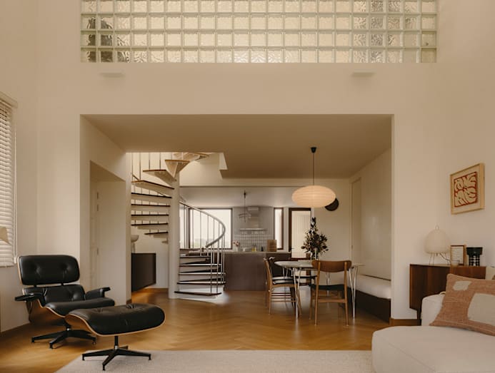
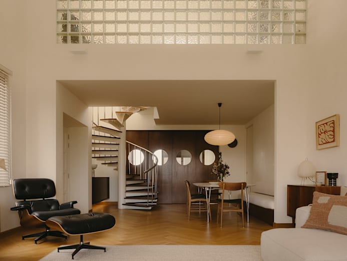
The apartment has another feature the wife is fond of – a spiral staircase with stainless steel railings, enclosed by a white parapet with aged timber trim at the mezzanine. She shared that the property they had viewed before this one also had a beautiful spiral staircase, and she was delighted to find a similar one here. Together with the glass blocks, it adds to the apartment’s character. “We decided to retain these as we wanted to maintain a connection to the original design of the condominium,” said Ong.
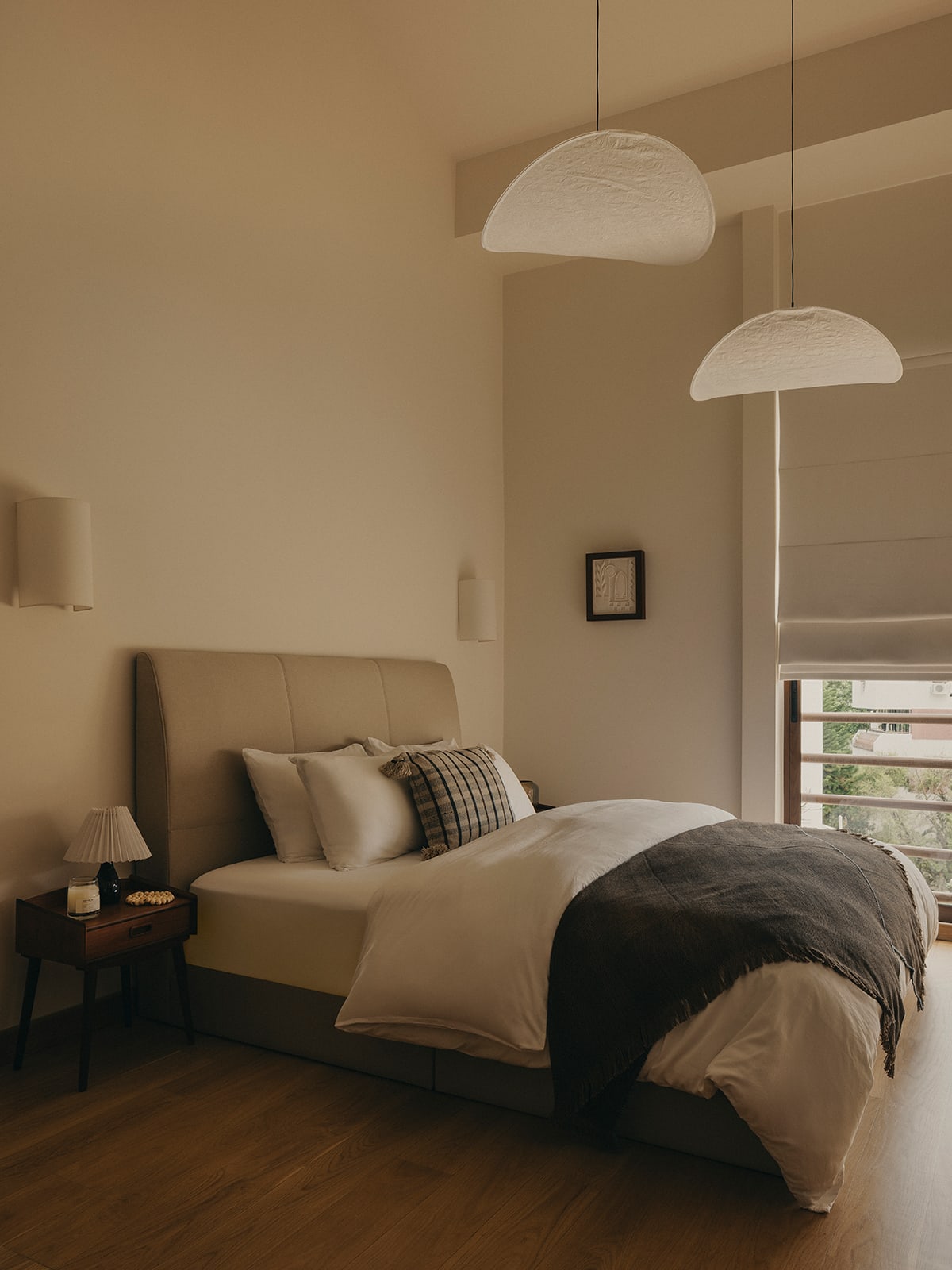
As we toured the apartment, the wife noted that she had been particular about aligning the walls during the layout rejig. “I wanted a calm space,” she said of the effort to smooth out surface inconsistencies. The home certainly feels restful, especially the master bedroom – which, like the living room, has a high-pitched ceiling after the false ceilings were removed. Two gossamer Tense pendant lamps from New Works float in the void like leaves suspended mid-fall, echoing the apartment’s breezy atmosphere.
Alongside the new furniture, the couple brought vintage Scandinavian pieces from their former home, sourced from local vintage shop Noden. These complement the apartment’s clean, warm and generous proportions. A good example of how old and new come together is the dining area, where timber chairs and a built-in banquette gather around a Superellipse table from Fritz Hansen. The extendable table can stretch to three metres.
“It allows the homeowners to host large groups and highlight this space,” said Ong of the table, which sits opposite the staircase just outside the kitchen. “The dining table in our former home was also an extendable piece with a vintage vibe, but it couldn't fit into this space, so I found this one; it's got the same vibe,” said the wife. “The vintage dining chairs are from Noden too.”
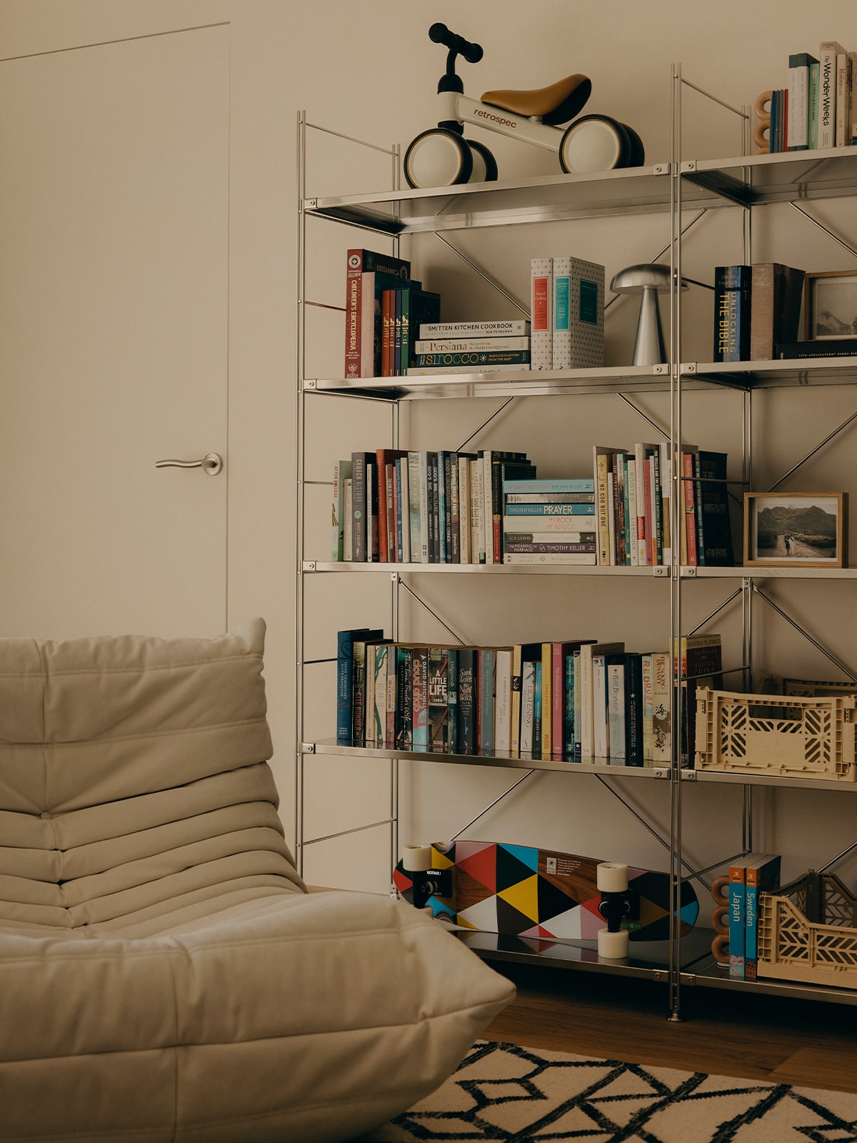
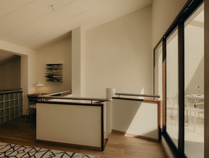
Aside from the balcony and the windows on the lower level, natural light and green views also enter the home through the mezzanine, which opens onto a large rear terrace via sliding glass doors. It is a cosy place for contemplation – well suited to the husband’s study corner and the Togo lounger by the bookshelf.
After the renovation, the apartment feels resolved and easy to live in. The home is breezy, and its timeless backdrop suits the furnishings – including a Reaction Poetique side table by Jaime Hayon for Cassina in the living room and a Lamina pendant light from Santa & Cole in the kitchen. “I feel that life here is very nice, very cosy, and very warm,” the wife said.